Accessible forms are just well-built forms
By The Askery Team
- accessibility
- form design
- a11y
Accessibility is not a separate project
Accessibility gets scheduled as a late-stage audit, as if it were a coat of paint over a finished form. That framing produces both bad forms and bad accessibility, because the things that make a form usable with a screen reader or a keyboard are the same things that make it clear for everyone.
A correctly associated label, a visible focus state, an error message that says what to do - none of these are accommodations bolted onto a finished design. They are the design, done properly. The accessible version of a form is usually just the well-built version.
Labels and structure are the foundation
Every input needs a real, programmatically associated label - not placeholder text standing in for one. Placeholders vanish the moment someone types, take the field's accessible name with them, and leave the respondent guessing what they were answering. This single mistake is the most common serious form accessibility failure, and it also just makes forms worse for sighted users with full attention.
Group related fields so the structure is conveyed, not just visually implied. A set of radio options needs to be announced as one question with several choices, not five unrelated controls. The visual grouping you would design anyway is the same grouping assistive technology needs.
Keyboard and focus, not just the mouse
A form has to be completable with the keyboard alone, in a logical order, with focus that is always visible. If you cannot tab from the first field to the submit button and finish the form without a mouse, it is broken - for screen reader users, for people with motor impairments, and for the power user who never touches a trackpad.
Removing focus outlines for visual tidiness is a recurring self-inflicted wound. The outline is not clutter; it is the only thing telling a keyboard user where they are. If the default ring is ugly, restyle it - never remove it.
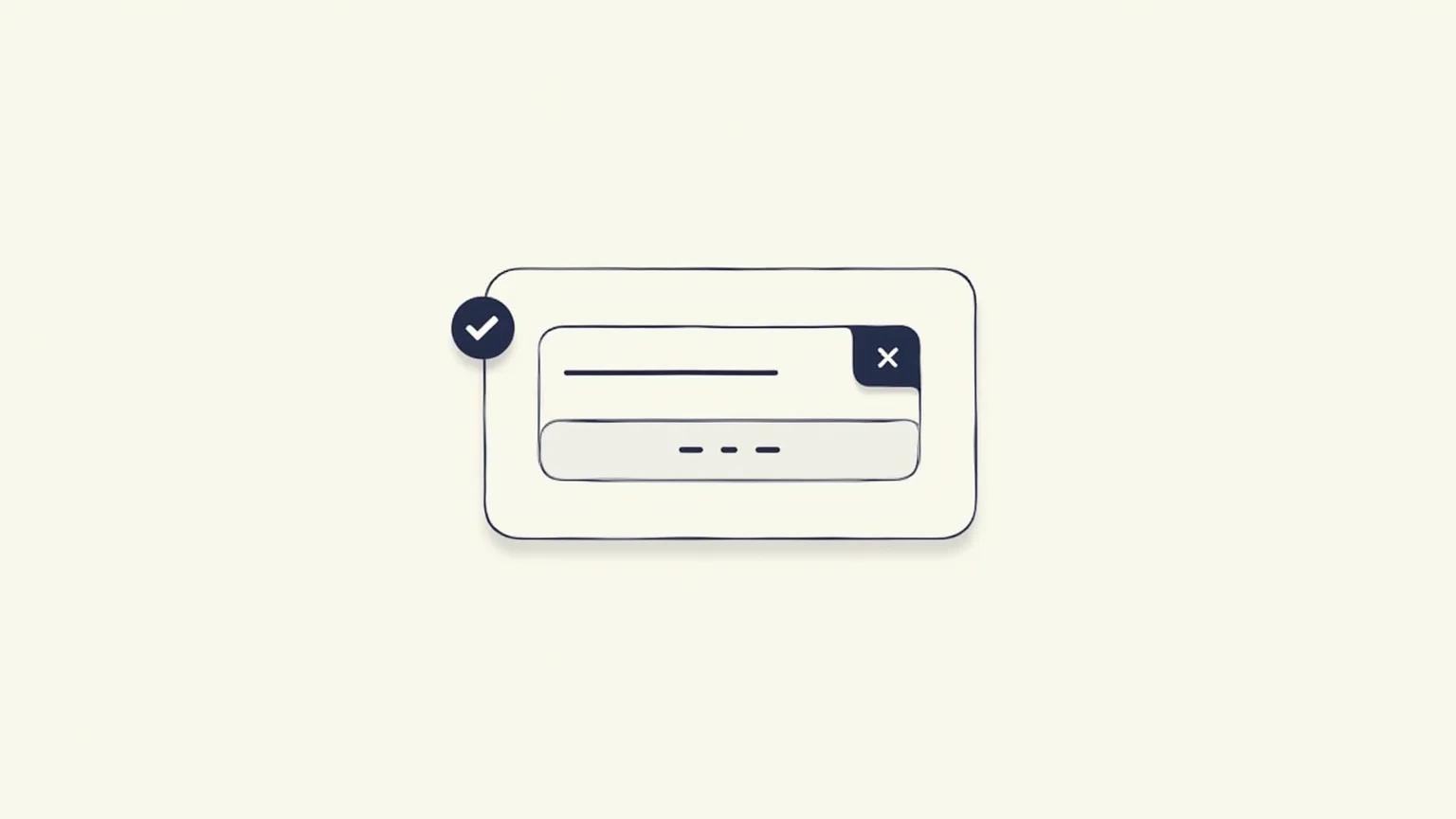
Errors must say what to do
A field that turns red is not an error message. The respondent needs to know which field, what is wrong, and how to fix it - in text, associated with the field, and announced when it appears rather than left for someone to discover by scrolling.
'This field is required' under an empty field is fine. A red border with no text is a dead end for anyone not looking at exactly the right pixel. The clarity that helps a screen reader user recover from a mistake is the same clarity that stops a sighted user abandoning the form in frustration.
The payoff is shared
The argument for accessible forms does not have to rest on compliance, though it satisfies it. It rests on the fact that the work overlaps almost completely with the work of building a clear, low-friction form - the same goal behind everything in our writing on form conversion.
Captured properly from the start, accessibility costs little and is nearly invisible as a separate line of effort. Retrofitted at the end, it is expensive and never quite right. Build it in, and it stops being a project and goes back to being what it always was: making the form good.